Connecting Brands with Influencers in 3 clicks!
Built the company from 0 to 2,000+ customers and exited in a $13M acquisition
Overview
Role
Co-Founder. Led design, product, and strategy
Responsibility
Led design and product from pre-launch through scale
Timeline (7 years)
Apr 2017 - May 2024
About the Project
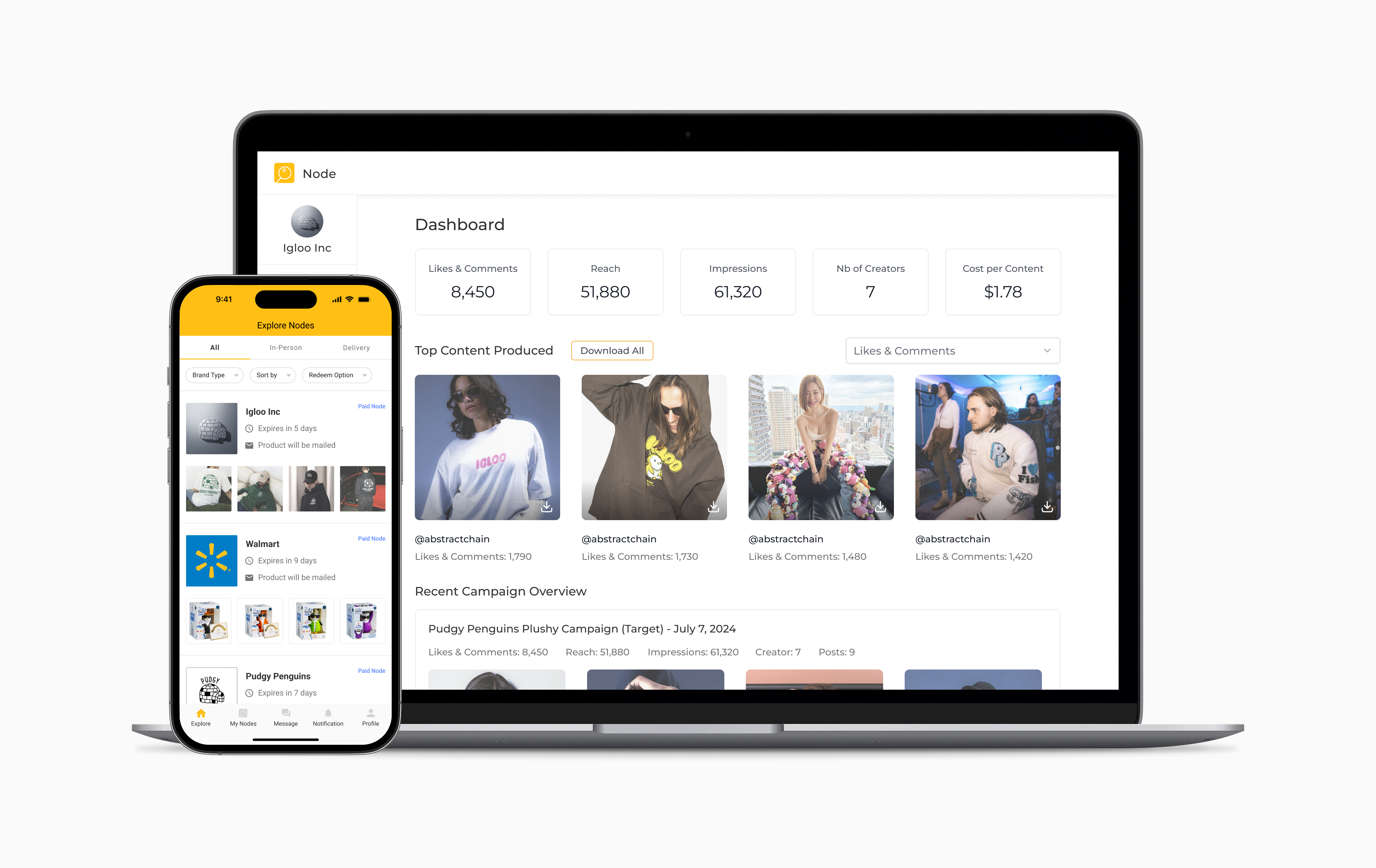
I built Node App, a self-serve influencer marketing platform that connects brands to influencers. The platform streamlines the entire influencer marketing workflow across campaign creation, influencer casting, management, and reporting.
I led design and product end-to-end from 0 to 1, then scaled it through acquisition. I designed the full web and mobile experience and managed the engineering team throughout.
Outcome
⭐️ Acquired by Canada's Largest Influencer and Modeling Agency ⭐️
Node App’s growth led to major traction, press coverage, and a $13M acquisition. Highlights below capture key milestones from the journey.
Business insider

$13M acquisition featured in Business Insider
Times Square
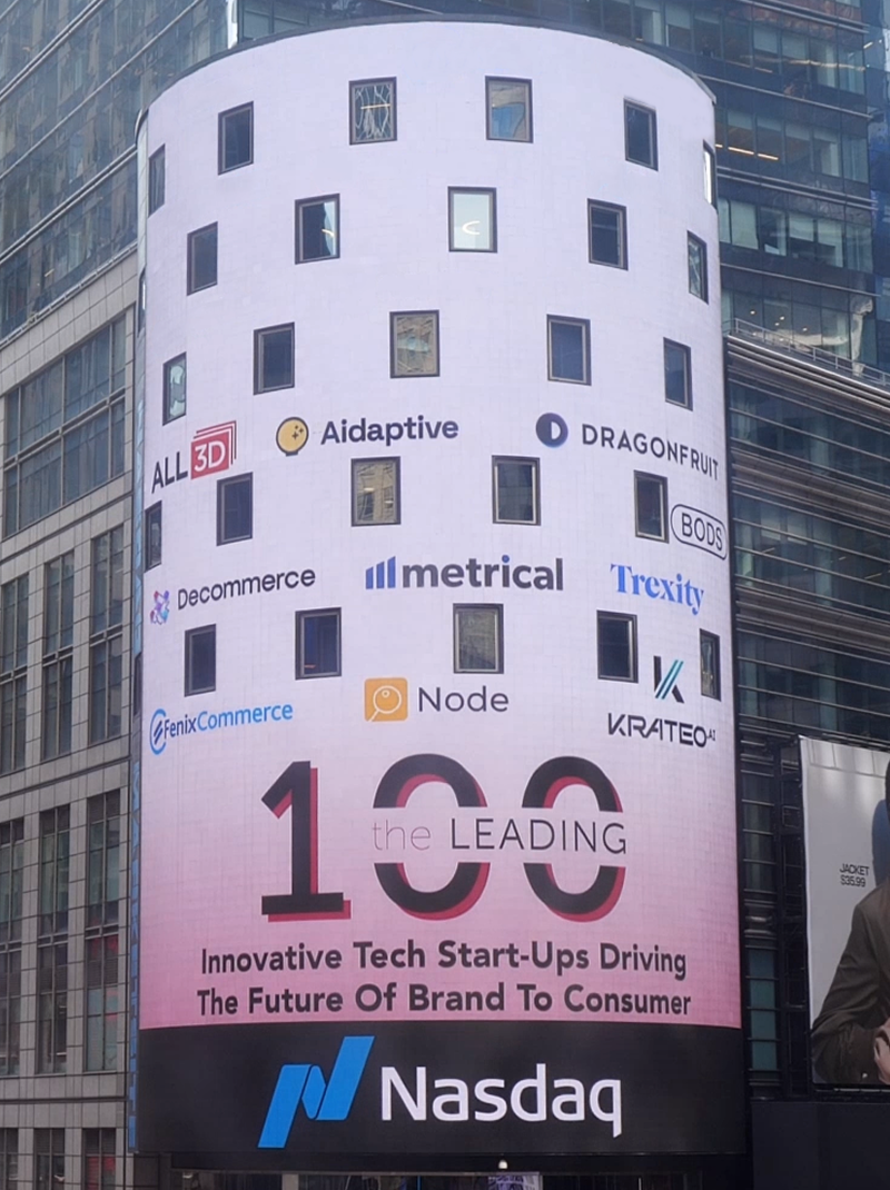
Node App featured at Nasdaq Times Square
First Press Coverage

Early traction covered by National Post
Context
In Q1-2023, our strategy changed from growth to retention, as we prepared for an acquisition.
With M&A conversations underway, our priority became:
- Reducing churn
- Driving upsells within existing accounts
By analyzing support emails and usage data, we identified a clear bottleneck: the complexity of managing influencer collaborations often led to content that didn’t match what brands asked for.
So we redesigned the influencer mobile app around expectation alignment. I led product design for the mobile workflows from brief to content delivery, clarifying requirements and handoffs so creators knew exactly what to deliver and brands got what they expected.
This case study focuses on the mobile app’s visual and interaction design.
Problem Framing
The biggest driver of brand churn was content that didn’t match what brands asked for.
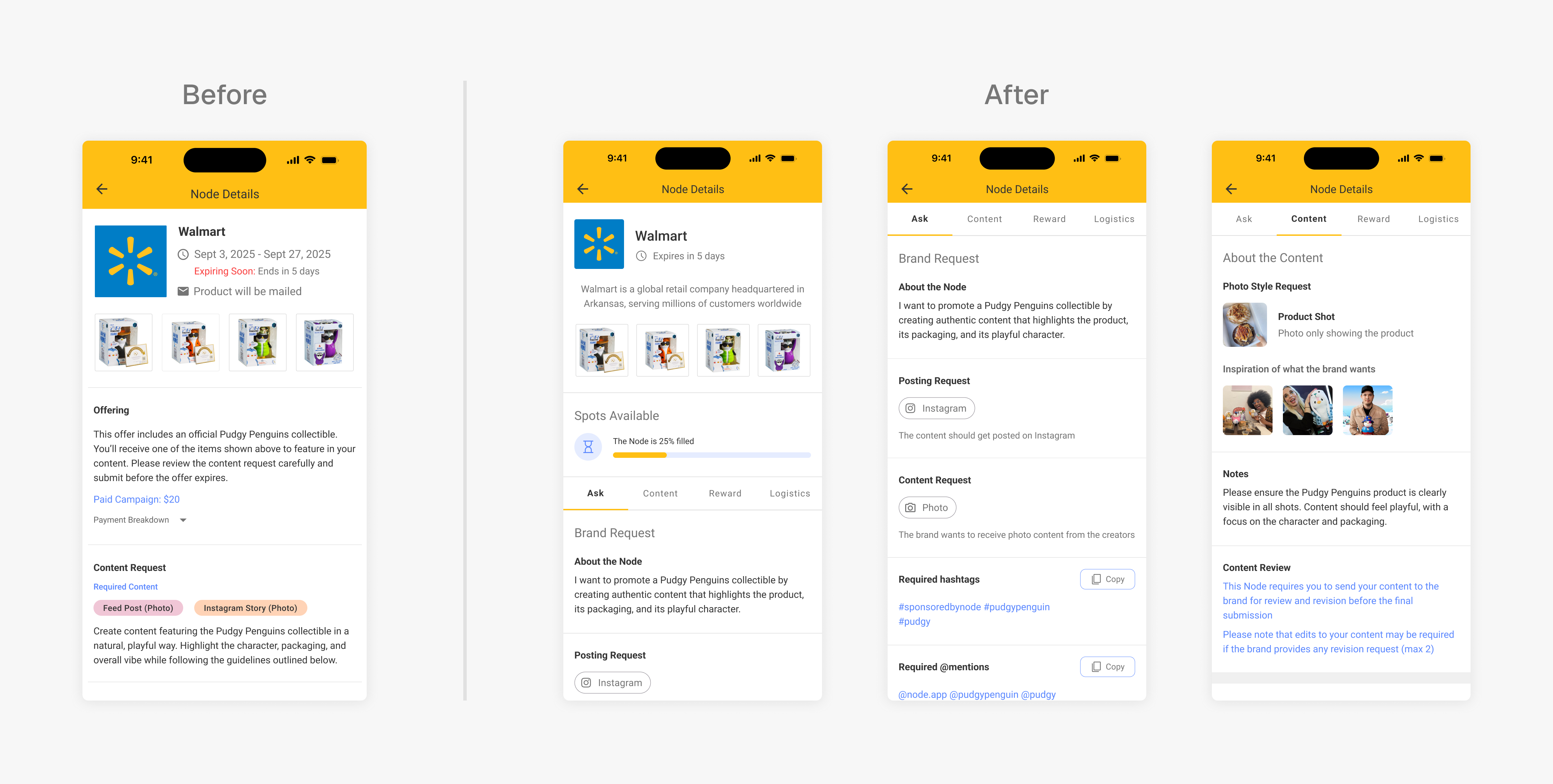
As the company scaled, one of our core value propositions was helping brands fill campaigns quickly. We optimized the application flow to reduce friction and increase influencer participation. That speed came with a tradeoff.
Brands often reported that the content didn’t match what they asked for before churning. On the other hand, influencers almost always believed they were following the brief. This made it hard to determine whether the issue was execution or communication.
What we found was consistent: many briefs had unclear requirements and lacked concrete examples. Communication was often too open-ended, causing important details to be buried, terms to be ambiguous, and leaving influencers with no way to confirm what “done right” meant.
Conceptualization
Exploration
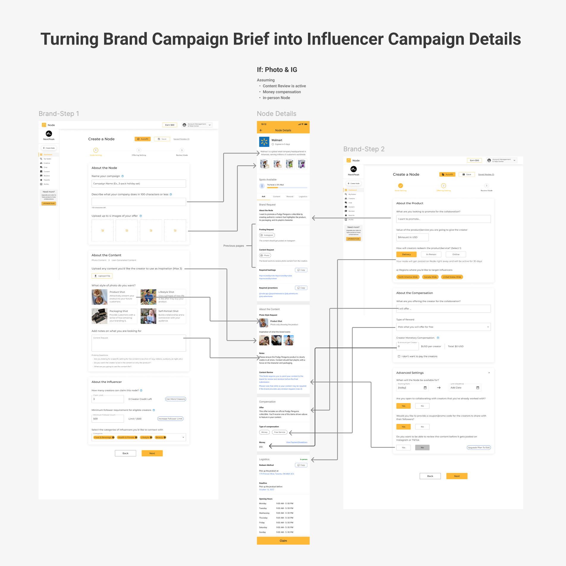
As lead product designer (and co-founder), I led the end-to-end redesign of the influencer mobile experience, focusing on translating campaign briefs into clear expectations for influencers. Conceptualization prioritized readability, reduced cognitive load, and clear influencer actions.
- Translate brand-side campaign brief inputs into an influencer-centered brief experience
- Clarify campaign requirements so they’re scannable, unambiguous, and hard to miss
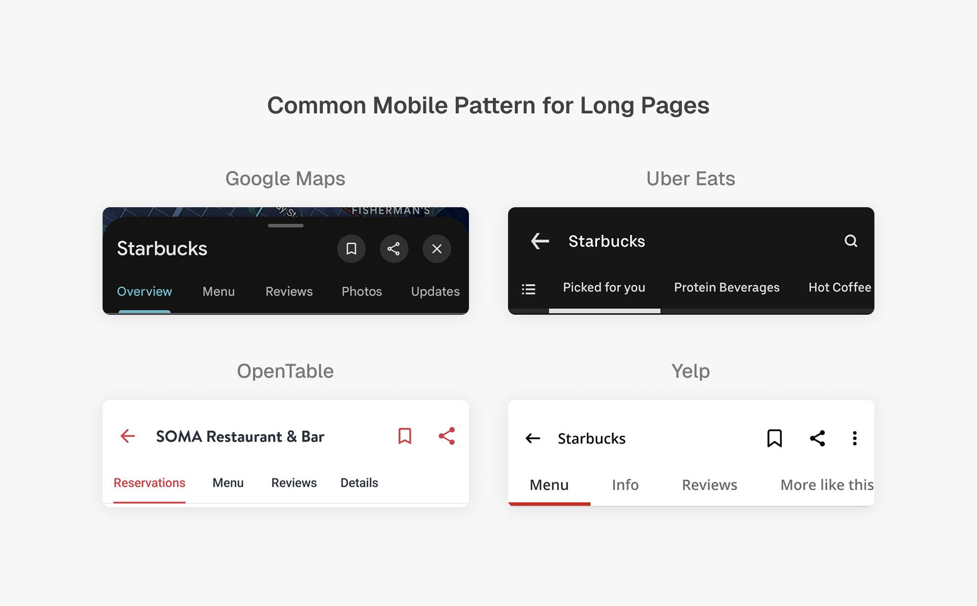
- Audit patterns for brief readability (hierarchy, sections, content blocks)
- Prototype motion to validate browsing and navigation before moving into high-fidelity
Final Designs
Overview
To redesign the campaign brief screen, I started by turning the brand-side inputs into a clear, scannable brief for influencers. The work focused on reducing ambiguity in requirements without slowing campaign participation. The designs shipped.
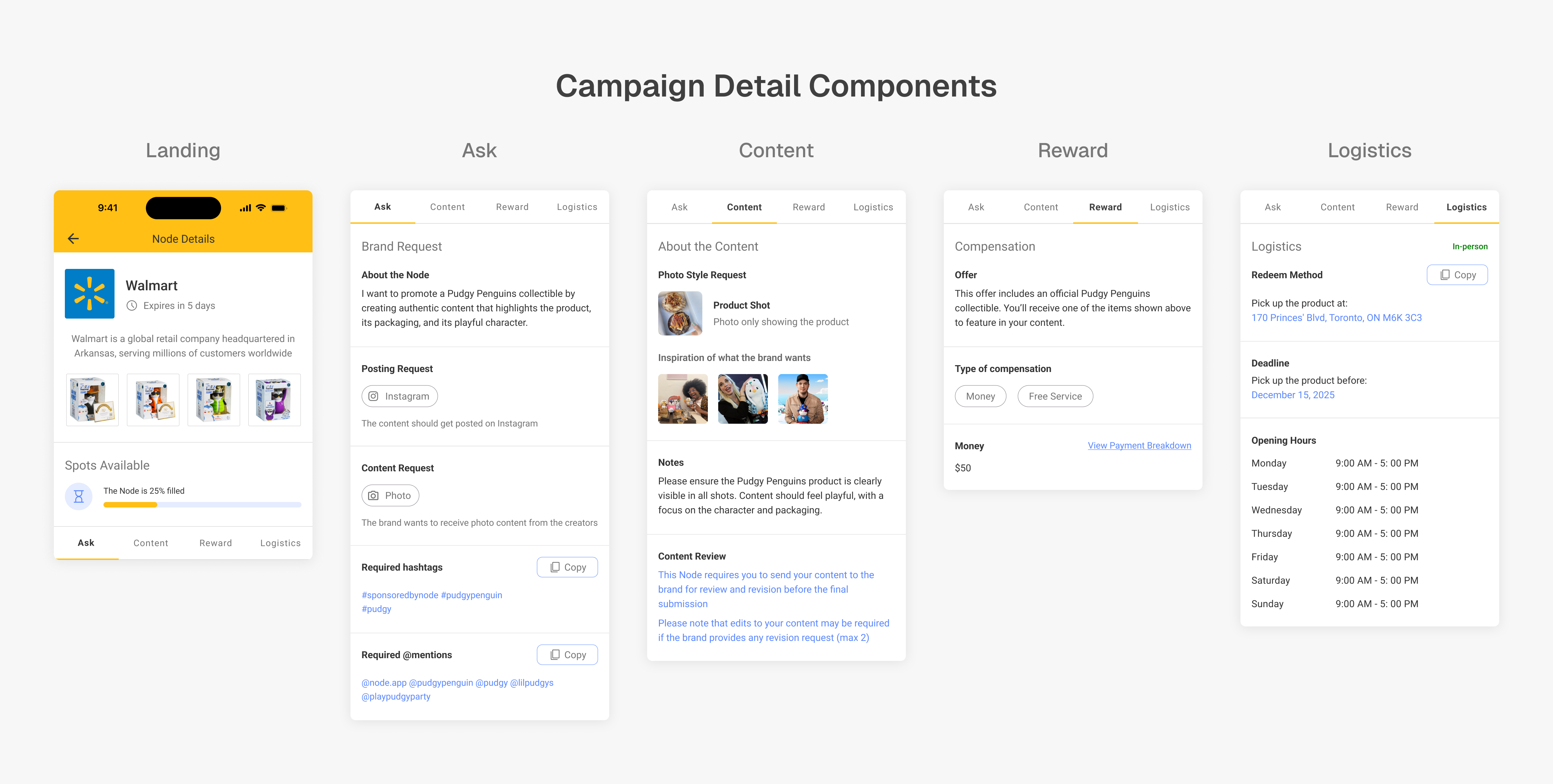
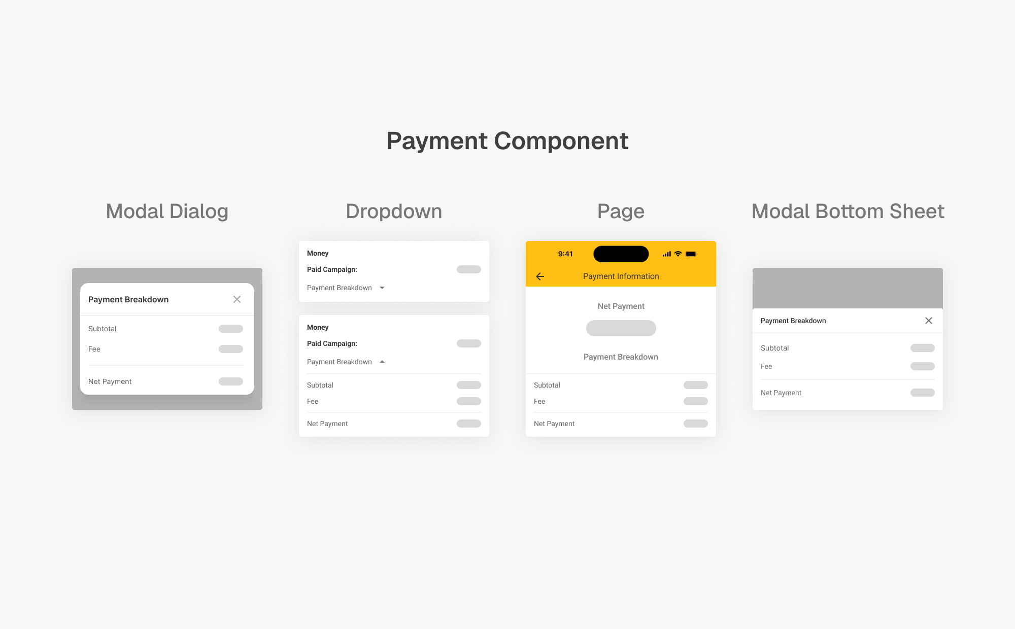
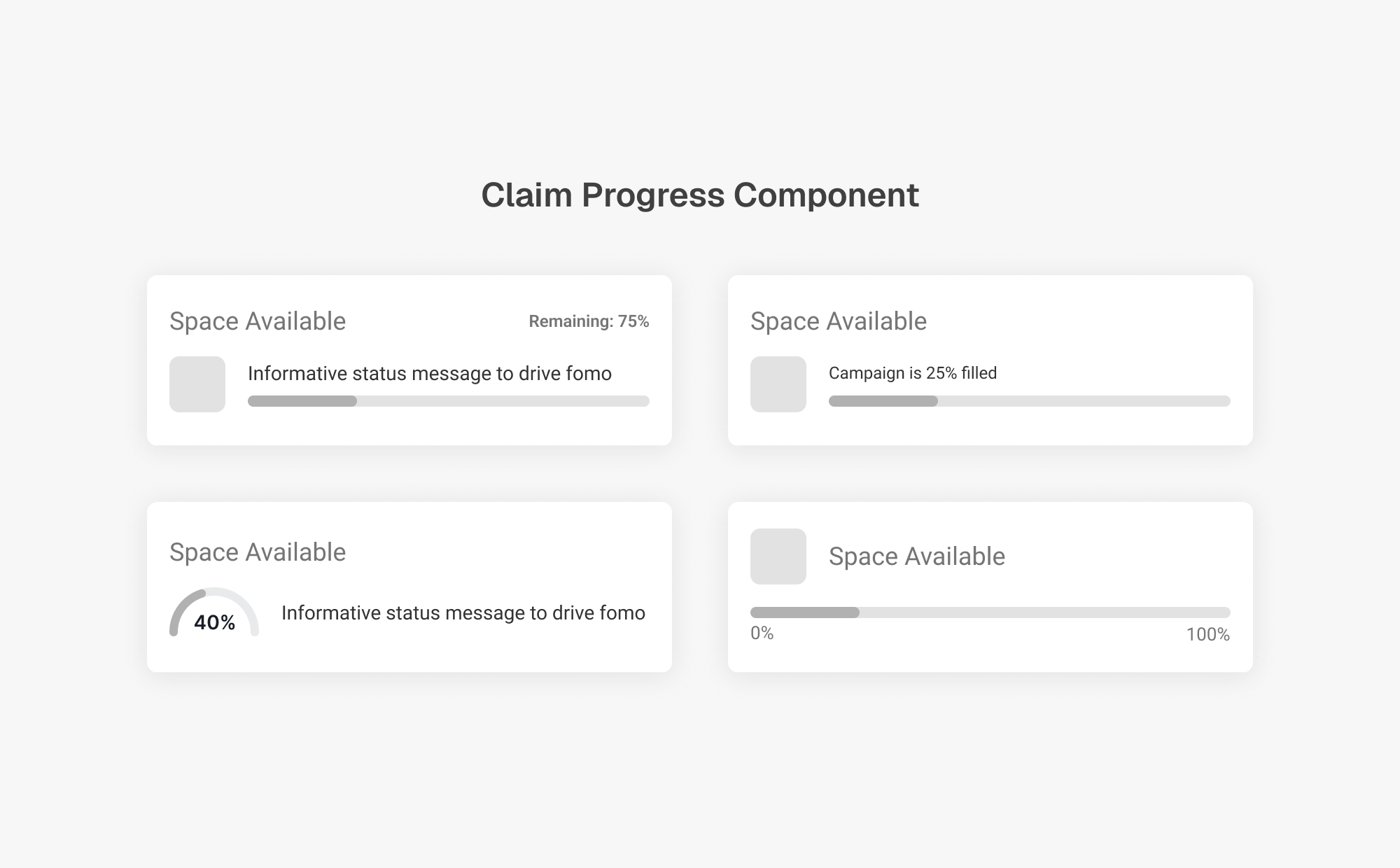
Compensation details were designed to be transparent and easy to inspect without disrupting task flow. Payment breakdowns remain accessible while keeping primary actions visible.
The inputs we collect from brands during campaign creation are mapped directly to influencer-facing components. This ensures requirements, constraints, and incentives are preserved.
Figma Hand-Off
I shared detailed Figma files with engineering covering component states, edge cases, and conditional behaviors. This included variations based on brand inputs and how downstream screens update in response to those changes.

Outcome
- Shipped the redesigned campaign detail experience.
- Net dollar retention stabilized, even though new-account churn did not materially change.
- Improved retention stability supported the business during acquisition diligence.
- Campaign claim rate increased from 75% to 85% within 2 weeks of launch.
- The company was ultimately acquired.
Learnings
1. Data Analysis as a Core UX Research Tool
- As we grew, I leaned heavily on data by analyzing spreadsheets, generating charts, and visualizing drop-off points. This helped me uncover patterns in user behavior and proactively design around them, making product decisions faster and grounded in evidence.
2. Designing for Business Impact
- I learned that usability alone isn’t enough. Effective design must align with business goals. Today, I intentionally design with distribution, monetization, and retention in mind, ensuring that UX choices support both user needs and company strategy.
3. Product Intuition Is Earned Through Iteration
- I’ve learned that product sense isn’t just instinct. It’s developed by shipping fast, tracking performance closely, and refining based on real usage. The more cycles I went through, the sharper my intuition became around what works, what doesn’t, and why.